Visualizing memory allocations
2025-02-17
I've been recently implementing a simple to region-based memory allocator to use in some future C projects. Regions are a nice way to simplify dynamic memory management since it's very similar to stack allocation and the headache of managing the lifetimes of each individual heap-allocated object is essentially eliminated.
I'm not going to go into how region-based allocators work as that has been thoroughly explored in multiple articles and blogs over the years, but I thought that I'd share a simple technique that I've been using to debug and study the behavior of my implementation. I have a definition of a region and a basic set of functions for creating one and allocating bytes from it:
Creating and freeing a region is trivial, so the allocation function is the one that I've been looking into. With each allocation the bump pointer is supposed to be moved such that it points to the start of the chunk of bytes allocated for the caller. As the caller is expected to specify an alignment along with the number of bytes needed, there's some calculation involved in figuring out how much the pointer should move. My allocator also allocates memory from the end of the region towards the start, so any padding bytes needed for alignment have to be added before the bytes allocated for the caller.
My first approach to following the movement of the bump pointer was to just print it's value along with the number of bytes requested and the number of bytes needed to pad the allocation according to the specified alignment, so pretty much what I'd expect most people would start with. This obviously worked fine initially, but I quickly found myself whipping out a calculator to ensure that everything was behaving as expected when trying out some more complicated allocation patterns. Manual calculations tend to get tedious after a while, so I decided to write a script to visualize these prints in a way that I can quickly understand.
I added an #ifdef to the allocation function for tracing which contains a comma-separated print for the pointer values and calculated byte amounts that are needed to verify that everything works correctly. Prior to printing these values, the first allocation also prints a corresponding CSV header, so when I pipe the output from my test program to a file, I'm left with a easily processable CSV file in the end. A generated file looks something like this:
The start and end pointer values are of course kind of superfluous after the print from the initial allocation, but with them available this approach works as it is for investigating multi-region scenarios as well, so I thought this was a nice format on top of which to build the visualizer script.
The script starts out with some data type definitions:
These are mostly there to ensure that the script is not working with raw dictionaries everywhere, which seems to be the case far too often with Python. After that we have some code to transform the rows read from the CSV into these Region and Alloc tuples:
With the CSV parsed, the script can then move on to calculating how each byte within the region is used. For that there's a function and an enumeration defined:
The calculations are very simple, which is nice. One noteworthy thing in calculate_byte_use() is the line where a byte is marked as allocated, as it includes 0s or 1s for the bytes within an allocation to allow the visulizing function to differentiate between adjacent allocations. I found this handy since some neighboring allocations obviously may not have any padding in between them.
Now that we have each byte within a region checked, creating various kinds of visualizations is possible. I started out with this function that just prints a character for each byte within the region:
The os and xs denote allocated bytes, while _ and . represent inserted padding bytes and free bytes, respectively. To me this is already quite a big improvement over using a calculator, but we can take it a step further to visualize allocations that may not easily fit on one screen in a terminal.
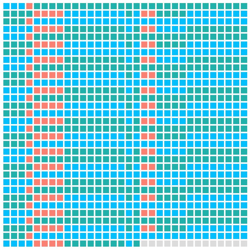
Visualizing all bytes in something like a 1KB region, which is ultimately still quite small, needs something a bit more colorful to make it easily comprehensible in a single glance. Initially I considered generating PPM images, but ultimately ended up implementing a function to output HTML since it was very simple to hack together in a couple of minutes. So I added this function that outputs an HTML file with a table where each cell represents a single byte:
In the generated HTML the cells denoting allocated bytes are colored green and blue, padding bytes are red and free bytes are grey:

I could definitely keep going with this idea, but I think this is plenty for now. The allocator seems to work fine after all.